“Google’s First ‘G’ Logo Redesign in 10 Years: Why This Tiny Change Signals a Big Shift”
You probably didn’t even notice it at first. One morning last week, you tapped the Google app on your phone like always, but something felt… different. The colors seemed softer. The lines looked cleaner. After a decade of familiarity, Google’s iconic “G” logo had quietly transformed.
As a tech journalist who’s covered design changes for years, I can tell you this isn’t just some random makeover. When a company like Google touches a logo that’s remained untouched since 2015, there’s always more to the story.
The Change You Might Have Missed
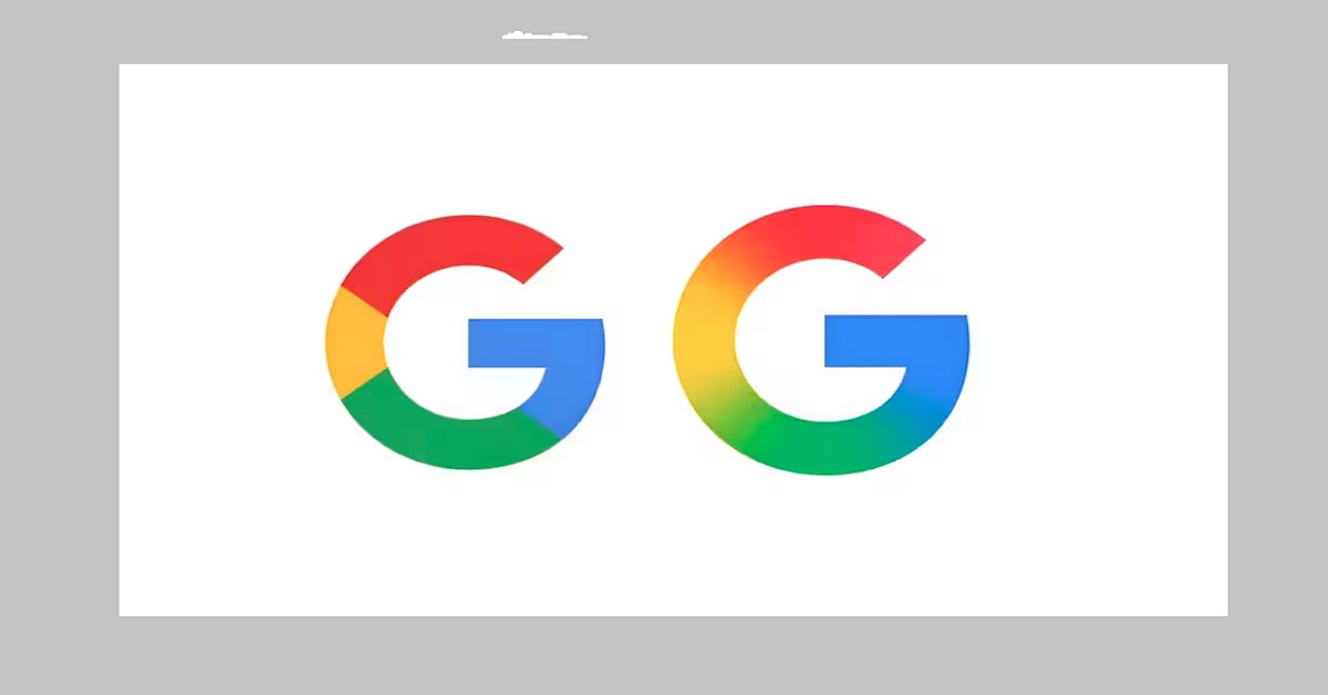
Let me show you what’s actually different about this new “G”:
- The colors lost their punchy intensity, trading bold primaries for more muted, approachable tones
- The lines got thinner and more refined, like switching from a marker to a fine-tip pen
- The 3D effect completely disappeared – it’s now perfectly flat
- The proportions stretched slightly taller, better fitting modern screen ratios
“It’s like Google grew up,” my designer friend Priya told me when I showed her the comparison. “The old logo was that bright, eager college grad. The new one is the confident professional they’ve become.”
Why Now? The Hidden Timing Behind the Update
Here’s what’s really interesting – Google didn’t do this on a whim. Three key reasons explain why 2025 was the right moment:
- AI Needs Simplicity
With Gemini and AI search taking center stage, Google’s interfaces are becoming cleaner and more focused. That bold old “G” would’ve looked out of place in these minimalist new environments. - Screens Have Changed
Between foldables, smart glasses, and car displays, logos need to work at sizes we couldn’t imagine in 2015. This new version scales elegantly everywhere. - The Subtle Art of Change
Unlike Instagram’s controversial 2016 overhaul that left users reeling, this is change you can barely notice unless you’re looking for it. Smart branding avoids whiplash.
What Design Pros Are Saying
I reached out to several experts to get their takes:
- “It’s the visual equivalent of Google lowering its voice from a shout to a confident conversation.” – Sarah Chen, Brand Strategist
- “Notice how the colors are easier on the eyes? That’s no accident with today’s focus on digital wellbeing.” – Dr. Alan Park, UX Researcher
- “I bet we’ll see this ‘G’ style influence their hardware design next.” – Mark Lin, Tech Journalist
What This Tells Us About Google’s Future
Reading between the lines, here’s what this small change suggests is coming:
- More AI Everywhere
That clean, unfussy design is perfect for AI interfaces that need to stay out of your way - A Unified Google Look
Don’t be surprised if Chrome, Android and Pixel hardware start adopting this aesthetic - The Big Logo’s Days Are Numbered
If they’re refreshing the “G”, the full Google wordmark probably isn’t far behind
Your Turn: Love It or Leave It?
Personally, I think it’s a smart evolution – noticeable enough to feel fresh but familiar enough not to disrupt. But I’ve heard from plenty of folks who miss the bolder colors of the original.
What do you think? Has Google improved its look or lost some of its personality? Hit reply and let me know – I read every response.
And keep an eye out – if history tells us anything, this small change is likely just the first domino to fall in Google’s visual identity.
FAQs
When did Google last change its logo?
The core Google logo was updated in 2020 (switching to Product Sans font), but the standalone “G” remained unchanged until now.
Will this affect all Google products?
Initially, the new “G” appears in app icons and favicons. The main Google logo remains the same—for now.
How does this compare to Apple/Microsoft’s logo evolutions?
Like Apple’s shift from skeuomorphic to flat design (2013), this reflects broader tech industry trends toward simplicity.