Exploring iOS 15 UI Design Changes: What’s New and What it Means for Users
With the launch of iOS 15, Apple introduces several intriguing design updates to its operating system’s user interface (UI). While some changes are subtle, they reflect an ongoing evolution toward user-centered design, optimizing functionality without losing the iconic Apple aesthetic. In this article, we’ll dive into the most notable changes, the reasoning behind them, and what they mean for users.
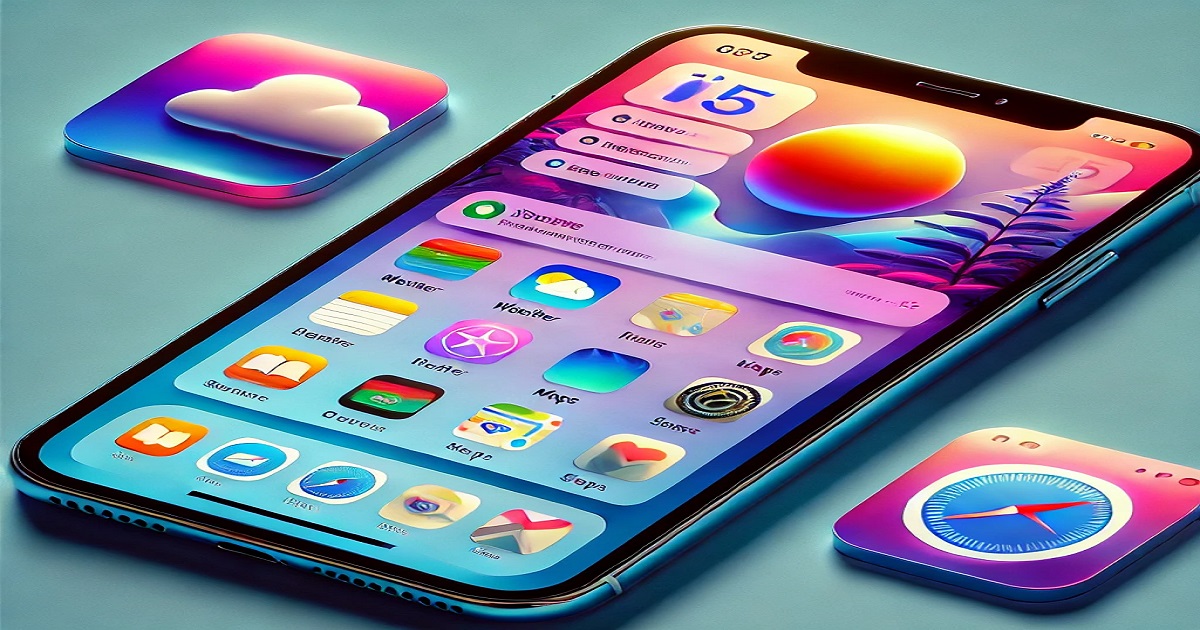
Fresh New Icons: A Splash of Color and Playfulness
iphone 15 iOS 15 brings a fresh visual style to the home screen, starting with revamped icons for Weather and Maps. Both icons now feature a more vibrant and cartoonish look, hinting at a glassmorphic trend. The Weather icon now includes a semi-transparent cloud, giving it a sleek, layered look. Meanwhile, the Maps icon has become bolder, with strong colors that bring greater emphasis to the directions feature—an update that will appeal to users relying on Maps for various transportation modes.
This visual overhaul aligns with Apple’s ongoing shift toward more engaging, approachable icon designs, enhancing user experience and making navigation more intuitive.
Enhanced Weather and Maps Apps: Visuals Meet Functionality
Apple didn’t stop at updating the icons; both Weather and Maps received functional and visual enhancements. The Weather app now boasts stunning animations that make checking the forecast a visually rich experience. Even with these beautiful graphics, Weather maintains a user-friendly interface, showing a wealth of information without feeling cluttered.
On the other hand, Maps has been redesigned to improve clarity, making it easier to differentiate roads, landmarks, and navigation routes. Although the color scheme may take some getting used to, it prioritizes clear information display, enhancing usability for everyday navigation.
Safari’s UI Revolution: A Bold Move with the Address Bar at the Bottom
One of the most discussed changes in iOS 15 is in Safari, where Apple has made a revolutionary change: the address bar is now located at the bottom of the screen. This update, which positions the address bar closer to the keyboard, allows for faster and more natural thumb access. Users can now swipe on the bar to move between tabs, which may feel awkward at first but has the potential to streamline browsing once users adjust to the change.
Apple’s bold decision to relocate the address bar could signal a trend toward more accessible, thumb-friendly designs—a possible glimpse into future mobile UIs. This design evolution may inspire other browser apps to explore similar adjustments.
Learning from Feedback: The Return of the Classic Time Picker
While Apple embraces innovation, it also listens to user feedback. In iOS 15, Apple reverted to the classic time picker design, replacing the less popular in-field time picker. This return to a more familiar and larger picker reflects Apple’s dedication to a user-friendly experience, showcasing its commitment to informed design decisions based on usability.
Iterative Changes vs. Revolutionary Shifts
Most of the updates in iOS 15 are incremental, enhancing functionality without major overhauls. However, Apple has balanced these subtle changes with bolder, experimental moves like Safari’s revamped UI. By introducing both small updates and significant design shifts, Apple demonstrates a thoughtful approach to UI design, encouraging users to explore new ways of interacting with their devices while retaining familiar elements where they work best.
Final Thoughts: What’s Next for iOS UI Design?
With these updates, iOS 15 sets a foundation for future UI innovations. Whether it’s the friendly, animated Weather app, the more functional Maps, or the redesigned Safari experience, iOS 15 shows Apple’s commitment to improving usability while keeping the interface fresh and engaging. As we look ahead, it will be interesting to see if Apple retains these changes or iterates on user feedback once again in iOS 16. One thing is certain: Apple’s design evolution is far from over.
Key Takeaways for Users:
- Weather and Maps Icons: More playful, vibrant visuals that make apps feel inviting.
- Enhanced Weather and Maps Apps: Improved functionality with a user-friendly layout.
- Safari’s New Address Bar: A bold, accessible change that brings a fresh way to browse.
- Return to Classic Elements: Apple is not afraid to reinstate familiar features when they work better.
As always, Apple’s UI changes in iOS 15 blend functionality with aesthetics, setting the stage for future updates. What do you think of iOS 15’s new look? Let us know your thoughts on these updates and whether you think they enhance your experience.